Renovation of an old building in Berlin by asdfg Architekten the main plan was to become a home for a family with three kids, but also to preserve the historical facade of the original building from 1844.


A good friend of mine bought an old house some years ago and asked us to develop a concept for its refurbishment. It became the first project of our Hamburg-based architectural studio, asdfg Architekten: the conversion of an old miller’s house into a home for a family with three kids. Due to its history and location, we considered the project a big challenge, but we also saw significant potential for it to become a unique single family house with a small garden in the center of one of the most popular neighborhoods in Berlin.

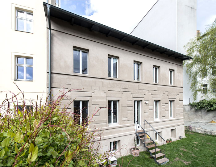
Because of its status as the oldest building of Prenzlauer Berg (built in 1844), the authorities asked us to reconstruct the facade of the heritage-protected building precisely as depicted on a historical drawing from 1844. We wanted to show the history of the old building, but we didn’t want to pretend that the facade would be 170 years old. In an architectural drawing, a line can be interpreted in many different ways: e.g. as a gap in the wall, a section line or a difference in height. The concept we developed was to argue that the lines in the historical drawing could be read as differences in the height of the plaster-rendered facade using ancient techniques and materials. It took us quite some time and many visualizations, and physical models to convince the authorities of our approach. As a result of its prior use as a police station and a workshop, followed by many years of vacancy, the house was in a very dilapidated condition, and the interior was divided into many very small rooms. To create a generous space, we only kept the outer walls and one massive wall in the middle.

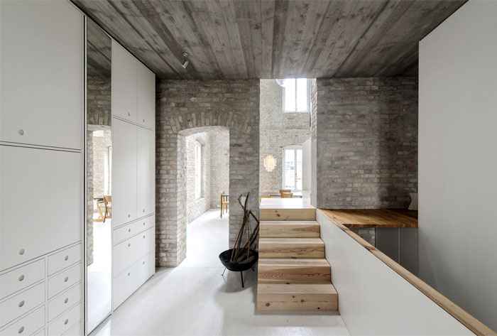
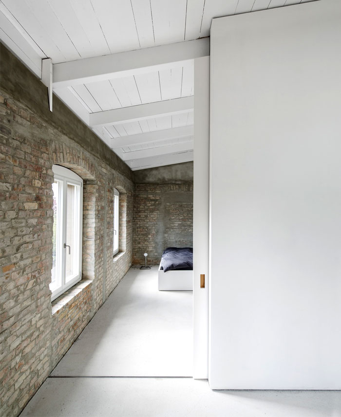
The staircase, kitchen, as well as the sleeping galleries for the children, are ‘plugged’ into this wall. The central inner staircase is divided into two parts. The first five steps lead through the big wall on a small platform, where it is possible to experience the full height of the main room. The second part hangs from an open gallery which spans from one wall to the other, creating the parents’ working and sleeping spaces, which are separated by a massive sliding door. For the staircase and the kitchen interior, we reused the wood of the old beams of the former ceilings. The old brick walls were left uncovered and are visible from the inside.

The design process was carried out in close consultation with the client, which resulted in many highly personalized and individually created elements. Not only the cabinets but almost everything, from the shutters to the washbasins and even the bathtub, was custom made for this project. Photography by Michael Pfisterer


