Located in Shanghai, China, EVD office is conceived based on two design threads that derive from site restrictions. One extends from the entrance to the interior, while the other is folded out vertically in the 5-meter-high space. Due to site limitations, the position of the foyer determines the location of the entrance. In addition, the structural framework and the five orderly window openings define the placement of the wall.


Sense of layering
The space has a rectangular plane. The designers created a U-shaped area that integrates with one long side of the space and the five large windows, which allow natural light to filter in and diffuse freely. The entrance protrudes towards the foyer, due to the consideration of fire control regulations. Its position and width for evacuation bring new opportunities for the organization of spatial pattern and form. The overall spatial design starts here.
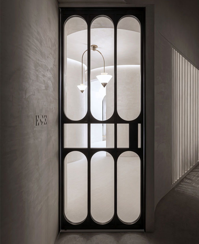
The entrance design is presented at three levels progressively — the field between the eye and the door, the interface constituted by the door and wall, and the space behind it. The door features combination of geometrical glass, which reveals the inside scenes, enriches the spatial layering and forms a contrast with the closed walls beside it.

Classical spatial languages
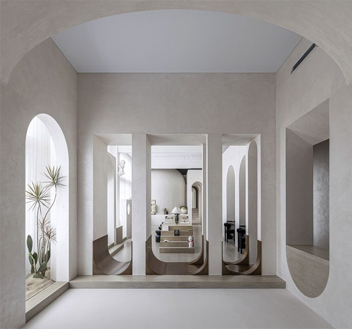
The spatial form of the office is shaped based on classical languages. It absorbs arched elements from Antonello da Messina’s masterpiece “St. Jerome in His Study”. In the painting, Messina depicted an “eternal” space that combines openness and privacy as well as fluidity and serenity by the use of arches, which can be seen on architectural and interior structures, landscape and furniture. Based on three-dimensional shapes, he turned the study into a piece of large “furniture” — the components of which act as flooring, roof, walls and columns.

Eternal elements
Pythagoras taught that sphere and circle were respectively the most beautiful among all solid figures and plane figures.
In the drawing “Architecture Comes from the Making of a Room”, Louis Kahn depicted a scene where people chat under a dome and light freely filters in. He emphasized the importance of natural light and geometric shapes.
For this project, the design team utilized classical architectural elements with modern approaches, to add a sense of eternity to the space. Besides, sphere — the most beautiful solid figure is brought in, which enhances the spatial aesthetic while enriching users’ experiences at spiritual level.


Varying dimensions
A single horizontal circulation may cause boring experiences, while vertical motion and the generated affiliated areas (including hidden corners or platforms) can bring more imagination and create unique spatial memory.
The users can experience scenes at different heights and varying details along the circulation, which guides them to explore the space and find the unexpected.
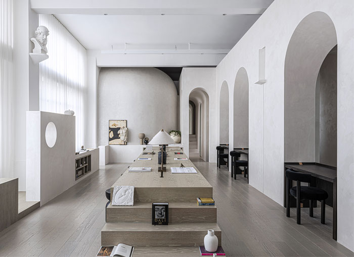
The designers took “garden” as the imagery of spatial scenes. The passages, carpets and adornments within the space are respectively the metaphor of paths, stones and plants. The design team elevated the area outside the door opening of the “garden” to create natural height difference of sight line and to endow the space with fun and a sense of mystery.


Spatial relationship
In his class, Carlo Scarpa taught students the necessity of creating certain relationships for architecture. “Boundary” and “in-between” are two words that indicate infinite possibilities of space. The designers created walls (i.e. boundaries) in the space, and combined them with the in-between areas that accommodate objects, sometimes forming passages together. The border between “boundaries” and “in-between” spaces may be blurred, but some items in the space help reveal their relationship.
New spatial relationships are inserted into the original spatial framework, to create multi-level experiences. Based on the office and exhibition attributes of the space, it’s conceived as a place that gives a “pure” spiritual feeling. Some areas are “infinite”, while others are “confined”. Together they are integrated into a whole via gaps and openings.


Windows
Windows create unique scenes, connect the interior and outside, and help enhancing the spatial ambience. A window opening is carved out of an interior wall, with its bottom 2 meters higher than the floor. People can hardly see the scenes behind it as moving in the space, but can perceive a sphere-shaped lighting source through the chromatic window glass, the color of which varies according to the changing brightness of lights. At night, colorful lights penetrate the window and cast onto the floor, producing a unique atmosphere in the space.


Integration
Artist Christo Vladimirov Javacheff is known for wrapping buildings and nature by fabric. The unified texture and color of fabric show a surreal aesthetic, and integrates buildings and landscape into a whole.
Walls, ceiling and stairs in this office are finished with white paint, which highlight the materiality and sense of sculpture of the space via dematerialized languages, while endowing it with a powerful feeling. In the rainy season in Shanghai, the hazy rain obstructs the sight line to some extent, and seems to generate another layer of “space” in this dematerialized space, hence forming an integrated and “eternal” realm.

Project name: EVD Office; Location: Shanghai, China; Design firm: EVD; Design team: Yang Bing, Hao Liyun; Photography: Super Yingxiang; Completion time: September 2019; Construction firm: Hancheng Decoration Design Engineering Co., Ltd.;


