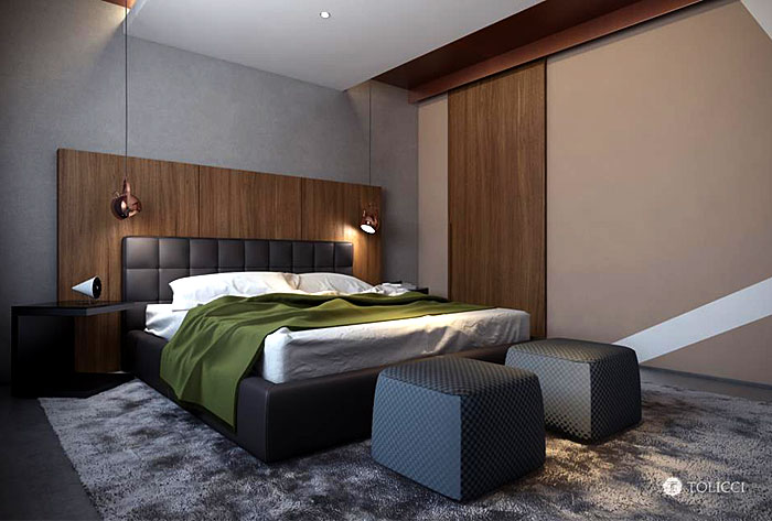
Studio Tolicci have designed a luxurious countryside residence in Slovakia. Before they represented a few of the living areas – kitchen, dining and bathroom, now they surprise us with a warm and cozy bedroom, furnished with style.

Project Description: Another part of our latest project is represented by the bedroom. Its layout allowed us to create a generous space in which the whole padded bed of chocolate brown color became the central feature of the room. As with every space designed by us, in this case we also have tried to create an exceptional area. We have created a number of supporting features and color accents, which make the presented bedroom more special. We advocate the idea that a well-designed space must be formed by a combination of diverse elements that together form a unit. In this project, we have achieved that by using multiple shades and structures that are in mutual symbiosis.

For the wall behind the bed we chose the surface finishing in the form of architectural concrete, which nicely blends into the tiled floor, which is also in the form of concrete. As a contrast to the wall we decided to use wooden paneling, which is located on the extended panel placed in front of the wall in the space. This solution created a visually interesting spatial game. Next to the chocolate brown bed we decided to place simple bedside tables of black color, over which we lowered the lights from the ceiling in a copper finish. With their warm tone, they conceptually and colorfully complement the bed and the wood paneling behind the bed.

We decided to support the idea of harmony and symbiosis of furnishing features by carpet with a medium-height pile in the shade of gray color. We placed it under the bed, so he protrudes from each side and provides the clients a soft and comfortable feeling when leaving the bed. There are also two poufs placed on the carpet, which serve the users of the bedroom for comfortable seating during the preparation and dressing. They complete the overall design concept with their colorfulness.

Against the bed is located a special area, where we placed one of our design products by TOLICCI studio. It has the form of low library. Behind the library we put a wooden screen – shade, which with its raster interferes with the uniformity and creates another interesting and contrasting spatial feature. We highlighted the longitudinal line over the bed by lowered drywall ceiling, into which we placed the spotlights. The straight line of the soffit is secured on both sides by unique surface finishing in the form of decorative screen. With its copper shade, she contrasts nicely with the shades of gray color and at the same time complements the lowered copper lights, placed above the bedside tables and the wood in the interior.

The great advantage of this interior is that it was possible for us to create a separate closet, into which a person can enter directly from the bedroom. It is enclosed by sliding doors, which construction we hid into the trim in the ceiling. To enhance the atmosphere of the interior we used asymmetrically folded curtains, which we also managed to hide into the trim in the ceiling. Thus, we have reached axial symmetry in the ceiling, which extends the space visually and also showcases the concept itself and the proposed design.
