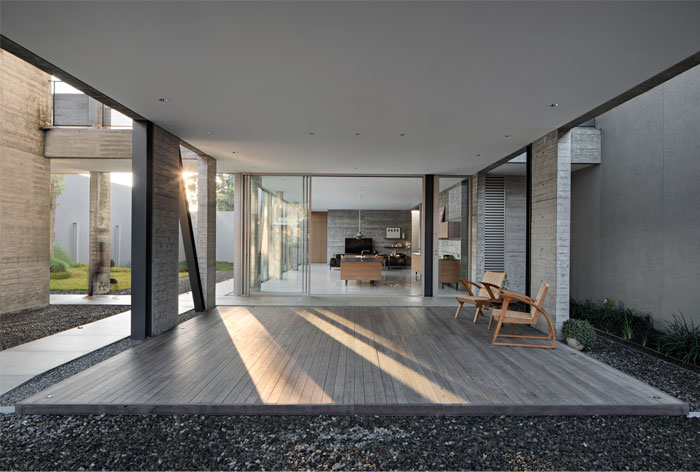
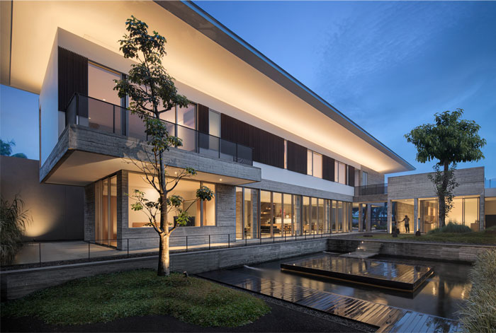
Just a step away from the entrance, visitors will be taken on a journey to enjoy the architecture of the house. Located in Bandung, Indonesia, Hover House presents architectural themes that experiment with gravity. From the beginning, the architecture of this house wanted to show that concrete which usually seems heavy can be designed in such a way that it looks light.


At the entrance of the house, there is a cogon grass garden that compliments the architecture which people can enjoy. Hover House has 3 masses which are divided based on their respective functions. Hover House has 3 masses which are divided based on their respective functions. If we enter the house area, there is an intersection that divides the entrance, the main living quarter, the service area, the front garden, and the back garden. So it feels there is a separation but still remains in one unit. The house itself is preceded by a semi-open foyer, framing a striking elevational view of the main building that houses the main living quarters.

The architecture is made more rustic and brutal, so it gives a different impression to visitors. The architect wanted to show that elements of brutalism can be combined with tropical architecture with a long and wide roof to control the flow of rainwater. During the design process, the architect team discussed a lot because this building uses a combination of steel structure and concrete structure.

The prevailing material utilized throughout the project is exposed concrete with a meticulously executed wood grain texture generated through the use of ‘heavy grained’ pine wood (Jati Belanda). In accordance with the theme, ‘hovering house’, the architect team consistently applied the theme not only in terms of the exterior but also interior and lighting.

To strengthen the impression of ‘hovering’, the interior is also filled with details that emphasize the theme. Furniture is made horizontally so that there is an impression of ‘floating’ and lightness. Thus, the entire gravity-defying experience can be felt not only from the outside but also when the users are inside the home.

Architects: Pranala Associates; Area: 760 m²; Year: 2020; Photographs: Mario Wibowo; Manufacturers: Hansgrohe, Louis Poulsen, Daikin, Duravit, MIWA, Tostem Aluminium; Lead Architects: Ronald Pallencaoe, Erick Laurentius, Darius Tanujoyo; Contractor: Bouw Atelier; Landscape: Larch Studio; Lighting Consultant: Lentera Art Lighting; Interior Design: Pranala Associates;


