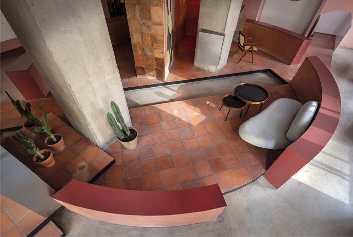
Cactus, a clothing brand, has a concept retail store in Xi’an, China. The client expects it to be pink and romantic.

A large area of pink will bring an excessive sweet taste to the space, and we are vigilant against this sweet and greasy. Instead, we tried to convey the tenacity and fashion qualities advocated by Cactus while maintaining the natural and pristine nature of the space.

In the search for materials with pink elements, we were intrigued by the old ceramic bricks for construction in Southern Fujian. In addition to its simple style and pink appearance, there was also the implication of “stones from other hills”. The transom of the exterior wall was removed and replaced with transparent glass, which not only brought more transparent views but also made full use of natural light and views inside and outside.

The window next door was rented to widen the front of the store. Through the integration of lateral ramps, the conversion of interior and exterior spaces on the ground floor was effectively organized. The green glass removed from the old windows was made into a counter on the ground floor to complement the color scheme of the space. In view of the spiritual status of art in space, large paintings of women were selected and hung in the store, which were soft, emotional and in pink tones. As a work that was selected at the beginning of the design, Modigliani’s Portrait of Jennie perfectly integrated with the whole space.

A white spiral staircase serves the “Communicating device” between the two floors and spirals up in the pink space. The outline of the stairs and ceiling is reflected in the circular sink below, like a metaphor leading to a pond by the garden steps. In a space nearly nine meters high, several irregular concentric circles are inlaid on the ceiling to form a scene of drifting clouds in the sky, demonstrating the appeal of freedom and bringing the space a fancy and charming sense.

With a splintered circle, the space on the second floor was divided in to different functional areas, which presents the layout of a garden and forms two spatial relationships inside and outside. The garden is raised overhead by steel structure and paved with red old bricks. At the top of it, largely identical pink blocks with minor differences are misaligned to correspond to the theme.

By a T-shaped passage extending from the center, the garden is deconstructed and divided again, while areas of different heights and functions inside and outside are connected. In this way, different layers are formed among different areas, and the transformation of layers is accompanied by that of the functional areas. In addition, the undulating surface creates a “sense of hilly area” similar to Chinese gardens, whereas obviously there are differences between the two. Interior Designers: Boundary Space Design; Area: 260.0 m²; Year: 2019;Photographs: Qiang Shen;


