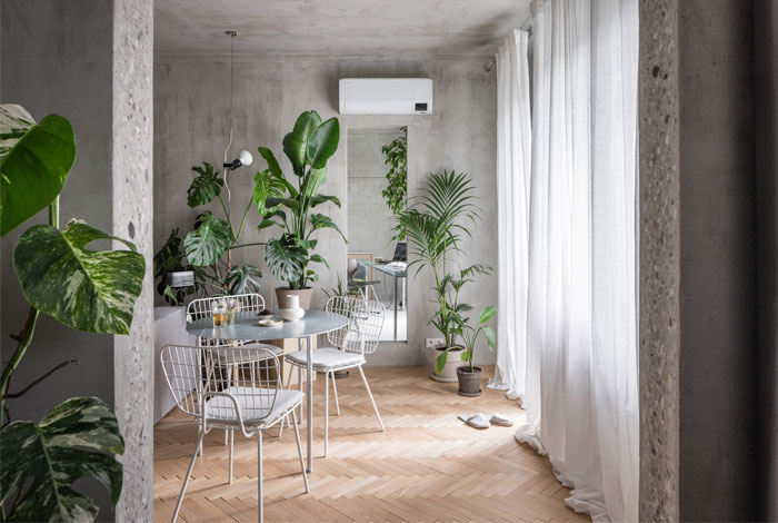
Kilo/Honc architects tried to work with a typified slab panel block floorplan from the 60s. The distribution of zones is standard and difficult to adapt to modern standards of convenience and fluidity. Family relationships and the scale of intimacy change through generations. The original space misses light and spaciousness.


The disposition is defined by the skeleton-panel 3D frame, spaced 3,9 x 3,9m which strictly defines the rooms. We are disrupting the scheme with simple openings. We let in light and create overviews and depth where they never were.

It is important for us to show that it is not necessary to condemn these apartments and that we can adapt them for current needs, in order to preserve them.

Opening up the space created overviews and depth by axially arranging openings (all of them dimensioned so that it is not necessary to use steel lintels and frames), directly connecting the kitchen and the day part, creating full-featured space for socialization, decreasing the number of doors (to wind lobby, kitchen, corridor, bathroom), and allowing daylight into the internal corridor tract via openings in the habitable rooms, whilst removing period decorative elements.

All of these interventions contribute to the creation of full-fledged, airy, inspiring, and open spaces, thus helping to find an affordable housing solution for young people.
Architects: Kilo/Honc; Area: 76 m²; Year: 2022; Photographs: Matej Hakár; Manufacturers: Berker, Element, Ikea, Karup Design, Mawa Design, Nesia; Lead Architects: Richard Kilo, Matej Honč;


