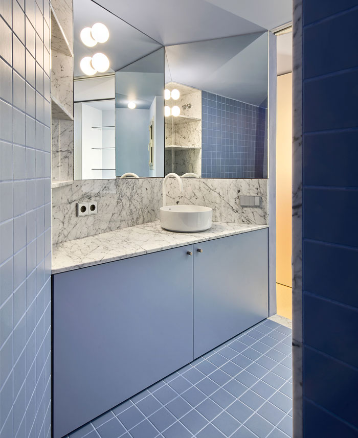
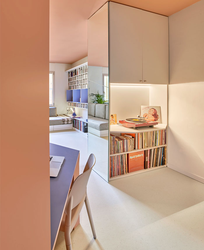
The house is located on the second floor of a building built in 1950 in the Eixample’s Nova Esquerra neighborhood, Barcelona. The building has 4 doors per landing and is used for discounted middle-class housing, as described by the architect F.J. Barba Corsini in the report of the municipal works file.
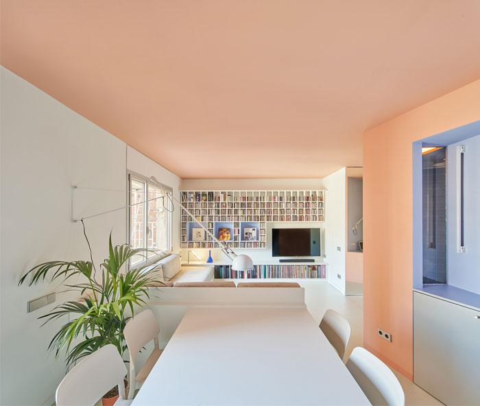
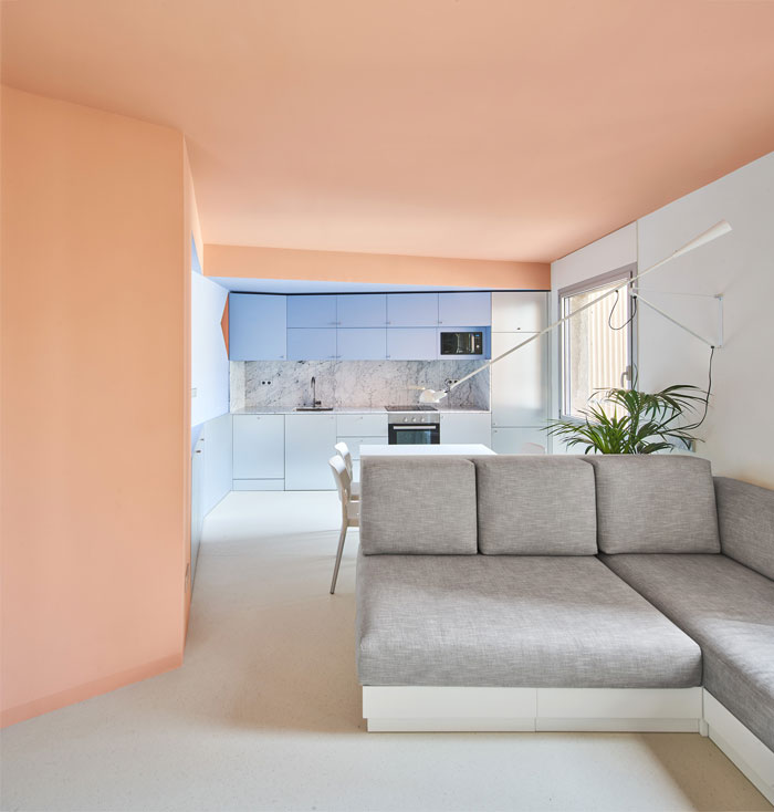
The structure of the house is made of load-bearing walls, with 6 openings parallel to the street, including the 4 façades: the two main ones and the two belonging to the interior courtyards. The floors are divided into 2 by the central load-bearing wall, which is joined by a small installation. The house is accessed from one end and its main façade overlooks the inner courtyard of the block. It consists of a living-dining room, a kitchen, two bedrooms, and a restroom, in a conventional and crushed space. The total area is 47.59 m2.

The project aims to eliminate speculative distribution and, by removing one of its rooms, it gets to use the small central ventilation patio as a central area around which to rotate.
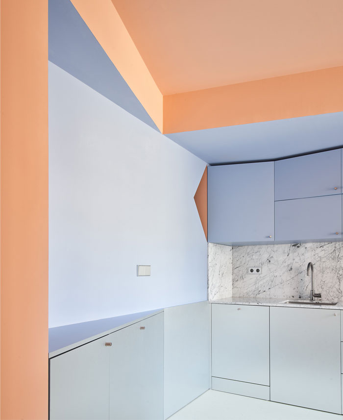
A shoring is proposed in the load-bearing wall that intended the circulation around the center, and the rest of the partitions are demolished. Integrating the load-bearing wall and the patio, the surrounding volume of the toilet is proposed, with a continuous strip of kitchen and cabinets on the partition opposite the entrance.
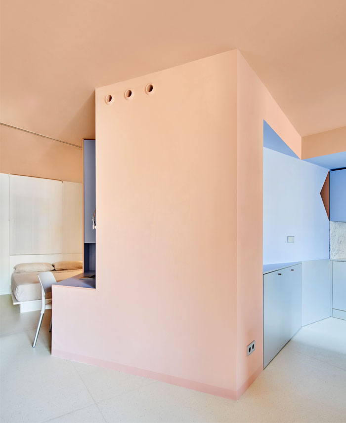
The strategy which, as usual, is cut short by the refusal of residents to carry out any type of structural intervention, no matter how minimal, forces us to turn the project around without losing its essence. The inconvenience does not prevent solving the planned program, as well as unique characteristics of the project: specifically, to accommodate the owner’s collection of more than 1,400 CDs and 1,200 vinyl records, which is why ad hoc integrated furniture is designed.

On a material and chromatic level, the northeast orientation of the only exterior façade makes the choice of flooring towards a clear surface that allows reflecting the scarce incoming light, while the color of the ceiling is used as an element of warmth and comfort. This tone extends to the polygonal volume of the bathroom, softening its edges and contrasting it with a bluish tone that emerges inside and extends to specific points. Metallic elements contrast and nuance the almost milky and warm atmosphere of the house.

Architects: AMOO; Area : 506 ft²; Year : 2022; Photographs :José Hevia; Lead Architects : Aureli Mora, Omar Ornaque;


