We may not feel it while living our everyday life but the new technologies and innovations change our world so fast and drastically that the newest tendencies in interior design for 2017 can be expected to be so surprising, intriguing and fresh, that imagination may fail while trying to predict. But we will try. So if you are curious to take a peek with us.
The furnishing becomes more and more adequate to the working atmosphere requirements and in home decor, the oblong shapes, soft textures, and organic materials tend to create tranquil and serene ambiance supplemented by warm, mild colors and soft forms – composing a space where one can escape and relax. So this search of harmonic, relaxing ambiance it stays as a milestone.

Interiors set-up by Studiopepe for Spotti Milano
But … except comfort people also love to travel and need dynamics and change – so it seems like the nomad spirit had captured the imagination of the creative minds of the designers this year and we can see some examples of homes on wheels. This mobility and aspiration for flexibility are tendencies that will change irreversibly the furniture design, the home products and the perception of a home itself.

Mobile Home Away From Home
Here is one example of how the need teaches us the German designer Nils Holger Moormann had spent many business trips sleeping in a camper van, so his creative mind had taken a leap and transformed a Volkswagen T6 bus into a mobile home-away-from-home. This comfortable solution reflects the creators love for minimal materials and simple design combined with spicy trendy twists (like the dark color palette).


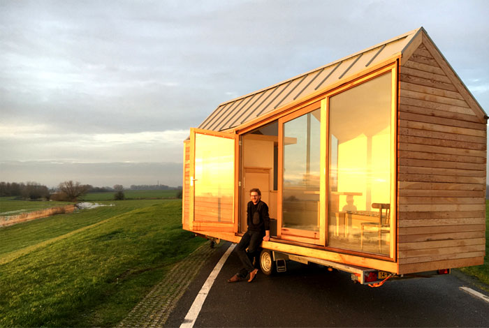
This tiny house carrying the Scandinavian spirit of natural simplicity is one of the first houses on wheels being constructed in the Netherlands. The Dutch designer Daniël Venneman composed the “porta place” as an open continuity space – the large windows and the transparency of the space arrangement and the architectural shell bring the sensation of free float and connection with the surrounding.

In this way, the home not only emerges freely with the surrounding on which is located for the time being but also seems bigger than it is – proof that a tiny home does not have to feel tiny and that the free spirit, frees the shell. Light and natural materials fill up space and make it a cozy home.

The desire to escape the crowds and spend her vacation time without concrete inspired the young architect Christina Christova to create the project of this mobile vacation house called Koleliba (wheel-cabin). Despite its restrained size the house possesses all necessary features – kitchen with oven and refrigerator, bathroom and toilet, and convertible sofa-bed proving that the freedom and comfort in modern design are a matter of perception and creativity. The material palette is organic and elegant, straightening in this way the connection between nature and home.

Project of Garcia Cumini forAgape – Dot Line collection
This tendency for mobility, small living quarters and nomad lifestyle leads to a significant change in the functionality of the furniture and the design constructs of modern home dеcor. And that takes us to the next trend of interior design for 2017 – the modularity of furniture and the flexibility of design.

Minimalistic Bathrooms for Urban Dwellings
When it comes to the size and the shape of the bathroom design composition, the trend is going in the direction of smaller and more privet spaces. After the temporary pick of large and massive bathtubs, we observe the more intimate and minimalist directions when it comes to bathroom combinations. The shape and the size of toilets zincs and bathtubs are considerably reduced, not only to fit better in the smaller urban apartments but also to introduce a sense of restrained elegance and intimacy. So smaller does not mean less – there is no compromise with its comfort, style, and functionality.

Hers is one very compact, contemporary and elegant example of restrained functionally – bathroom furniture set, a creation of Stefano Cavazzana – Oblon Collection for Novello.

Modular Furniture Systems
Modularity is another trend for the future – called from necessity and creativity and enabled by the modern technology the modular systems offer not only functionality but also playful spirit and upgrading ingenuity. The most visible changes are in bathroom design. As we already shared with you, the trends in bathroom design are leading to smaller spaces, flexible furnishing arrangements and comfortable and light design.

Bold and innovative projects like the one of Natalia Geci – nomadic furniture system, occurred lately and just take our breath away with their witty elegance and high functionality. Like in other cases, the personal experience inspired the Argentinian architect and designer Natalia Geci to create a collection of modular freestanding pieces that can fulfill all household needs even for a nomadic lifestyle.

The Lynko furniture system is for those of us that find ourselves in constant “moving in and out” situation while still aiming for some stylish standards regarding home design. After years of tossing her furniture when it was time to move, Geci looked for a configurable solution that produced less waste and could easily work in any household. Flexible enough to create a compact office, valet stand, or even a kitchen this collection possess not only unique charm but also very practical elegance. The collection features varying sized metal frames that can join together in any configuration with wooden hinges.

The frames can be folded flat for storage or moving. Easy to assemble the modular system comes with additional accessories to fit in – mirrors, hooks, hangers, trays, shelves, pockets.

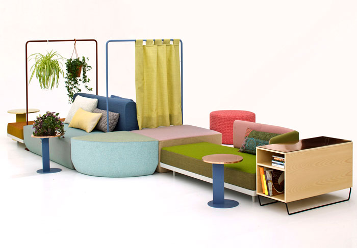
Another magnificent example of the modular furniture trend is this modular sofa designed for Moroso by Werner Aisslinger the Bikini Island – pure joy and colorful fun you can assemble yourself.

The modular furniture system is designed so that you mix and match the elements to create your own custom piece becoming a co-creator of your home. With components like stools, tables, coat racks, containers, shelves, screens, work surfaces, and seats, Bikini Island has you covered in regard of any home necessity that may occur in contemporary interior design. The design is meant to challenge the conventional ideas of home decor – your sofa does not have to go against the wall to form the traditional layout. The center of the volume is where you decided it to be – the color scheme is playful and vital as much as you desire. Aisslinger’s thought behind its creation is to “bring friends and family together in a world where we’re so focused on all things digital.”

The modular furniture systems will take over the dwellings of the urban nomads, the young people that regularly change their homes or the simply the life arrangement of those who prefer dynamic ever-changing ambiance. The advantages of the modular furniture systems are many and keep in mind if even renowned brands like Moroso are turning their attention towards this innovative approach in furnishing it comes to show how significant trend is this turning out to be.

The third significant trend that is going to dominate the fashion design stage in 2017 is the Retro approach. For the return of specific forms, shapes, and colors from the 60’s and 70’s the music, fashion and film industries with series like Vinyl and Mad Men. But this trend stood out first to our attention in the furniture exhibition in Milan where the new collection of Patricia Urquiola for Cassina showed a brick wall, wooden beams and greenery composition that was inspired from a 55t pavilion – pure poetry whit a harsh twist.

Modern Furniture With Retro Inspiration – the 60’s and the 70’s are Back
The Rietveld Pavilion which served as an inspiration for the Milan exhibition, stand project of Cassina’s Art Director Patricia Urquiola, was a temporary building designed in 1955 in Holland to display sculptures and later reconstructed in the Kröller-Müller Museum’s sculpture garden. It’s minimalist and artistic spirit was captured and redesign in a new light, upgraded and brought to new life by the Cassina’s contemporary attitude.

Fantastic furniture pieces designed in the 60’ts but stopped from production were displayed at Milan’s exhibition as well and stood out as long lost pieces of art finally found their place amongst the public. The development of the modern production technology made it possible for those designs to see the light of day again.

This beautiful wooden chair a design of Carl Hansen & Søn created for the furniture company in 1950 and reintroduced today. Featuring oblong shaped wood veneer the CH22 lounge chair is like a sculpture of wood, representing the life of the tree and has a complex, intricately detailed construction that was hard to manufacture before the modernization of the production presses.

Another example of how the modern technologies made it possible for the beautiful curves of the past to find their way into the contemporary design brands is this solid wood chair – the Clad Easy Collection of Sollos designed by Jader Almeida. Suitable for home, office, inside and out – this masculine sculpture possesses an unexpected elegance and grace.

Or this example of characteristic graphic figures and furniture silhouette that take us straight back to 1960. The Baxter’s latest collection is channeling a strong retro vibe into the modern design exhibited in Milan.

The retro vibe can be felt not only in the chairs and furniture collections but also at other design elements like the lighting solutions and lamps are not spared from the inspiration wave coming from the past. Here are some strong examples which can be easily integrated into any modern design layout.

We must start with the project of the so-called “world’s first lighting architect”- Poul Henningsen. The designer, known by his initials PH, that studies the light and had spent his entire career investigating the importance of light for our wellbeing is known by the artistic implementation of his theory that the observer should not be subjected to direct glare from the electric light source. So in his creation PH 3½ pendant, Henningsen used a series of layered shades to both spread the light and conceal the light bulb, thus creating a softer more diffused lighting.

The original design drowns its inspiration from a 1929 brass lamp that despite being 80 years old, it is both modern and classic at the same time, making an ideal suite to a broad range of design interior environments. The PH 3½-3 pendant is a piece of Danish lighting design history.

Inspired by the old Japanese tradition of Chouchin (those symbolic paper and bamboo lanterns typically used as light outside restaurants and bars, or as lucky charms outside homes) this collection designed by Ionna Vautrin is mesmerizing with its elegant simplicity and charming style. The Chouchin family comprises three models with a colored matt glass body that thanks to its clever and artistic design diffuses light brilliantly, creating an emotional atmosphere for the decor. It is amazing haw one can take an old tradition and bring it into a new life without losing the magic and the symbolism of its original spirit and only adding a new modern read needed for its fit in the layout.

Another example of how timeless shapes can fit into any modern layout is this elegant collection of a chandelier, hanging lamps and table lamps by Jaime Hayon. Combining the stylish minimalism of their clear-lined metal and ceramic bodies with the hand-crafted charm of traditional hand blown glass the collection is making a memorable impact on the design scene.

Limited Urban Dwellings
Another design trend that is strongly visible lately and it is worth keeping an eye out for in 2017 is the game that designers play with very limited and confined urban dwellings. It is no wonder that the restrained space offers a big challenge to any designer and is a tendency that will provide a virtual battlefield for the designer in the feature more and more often. Haw to secure a comfortable, stylish and welcoming atmosphere for dynamic urban lifestyle in merely 20 or 30 square meters of living space?

And keeping in mind that the tendency in Europe and Asia is to reduce the living spaces even more in the years to come. This game – as we call it – between the imagination and creativity of the designers and the pressing reality is a trend worth observing closer. This year the game offered us some amazing examples of modern design and innovative ingenuity.

This renovation project is a good example of how the small living space, that is more than a necessity in over-populated Taipei City, can be turned into not only functional and comfortable dwelling, but also can by stylish, innovative and modernly fashionable representative of contemporary design.

The minimalism and the clear-lined space are good choices not only because the place is only 22 sq.m. but also because the urban dynamics of the client’s lifestyle are well suited to the simple design approach. This deep understanding of the necessities and lifestyle choices of the owners is one of the bonuses coming out from the fact that when working it limited space the designers need to figure out very precisely every detail and be clever when arranging the design layout so the long-term living experience is comfortable and stylish at the same time.

Here we have another contemporary Asian design example of functionality and grace for a small space home. Designed for two sisters this project of Folk Design features an eclectic mixture of traditions and modernism, organic materials palette and trendy fresh greenery compositions and pure white surfaces, which mixed make a cozy, welcoming dwelling to inhabit.

In this case, the very aesthetic idea and arrangement of multiple levels throughout the apartment: in the bedroom, food preparation zone, and even storage compartments; is not only a clever modern functionality twist but also an artistic expression of the idea of city life.

The metallic gold shine of the curtain made from a isothermal emergency blanket in this small apartment in Florence becomes its signature design touch. Architect Silvia Allori has redesigned her 42-sq.m. living space into modern dynamic and functional home and working office.

A panel folds down from the living room wall to form a table and reveal a bookshelf, while built-in sofas can be converted into beds- so this functionality allows the place to be used to its full capacity and at the same time thanks to the stylish touch of its design to be also artistic and elegant.

Trendy Materials for 2017
What colors and materials will be fashionable and trendy in 2017? Well, our first choice is marble – integrated into to the design of bathrooms, kitchens, living room layouts this noble material is a tendency of old traditions that is getting a new, intriguing read.

Speaking of traditional materials in entirely new and unexpected roles – the bathroom trends that use ceramics, wood and marble in untypical and daring roles is a fashionable trend that delights and surprises us a lot, so we plan to observe it close, and advise you to do the same.

As for the other materials, the designers tend to stick to; colored-metals this year – brass, copper, gold, and silver are not out of style – in fact, the artists in the sphere of interior decor explore new, rich applications for these materials and that is a pleasure to observe.

Interior Design Color Trends 2017
The Dulux color forecast for 2017 draws its inspiration from exotic destinations from all corners of the globe woven through muted tones in four main palettes – Chroma, Sentience, Entwine, and Construct. The designers’ inspiration and color mixes for the next year are aiming to be earthy yet vibrant, strongly connected with the organic materials palette that we already spoke of (wood, clay, marble, copper), and that is expected to be a significant influence over the design scene for the next years. So check out these sensual combinations which you are about to see often in the feature.

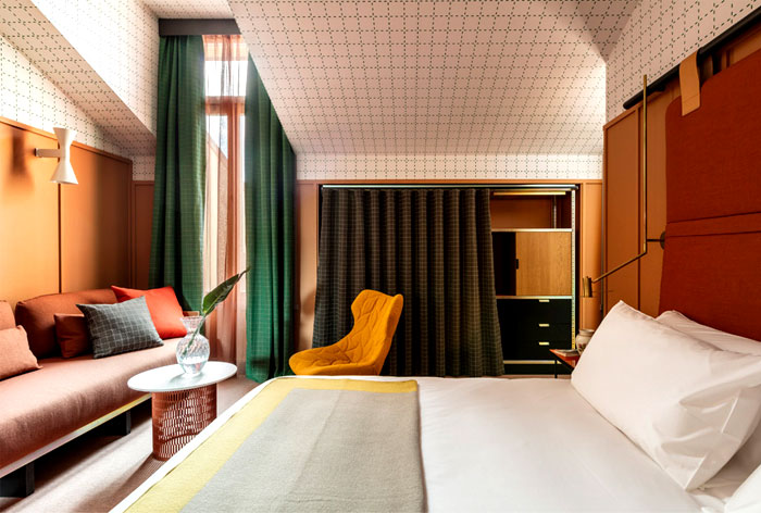
The Entwine color palette already inspires some renown architects and designers into creating warm, welcoming interiors white exotic touch. Like this new Milan hotel Room Mate – a design project of Spanish designer Patricia Urquiola. As Cassina’s art director Urquiola used the brands colorful furnishing and design elements into creating a vibrant atmosphere with a vintage touch.

Here we see more Manila and Butter cookie color combinations. This color scheme used in bathroom attire brings warmth and coziness to the fashionable design.

The newest projects of Materico by Jaime Hayon are aiming to prove that thought creativity, artistic inspirations and careful color choices the bathrooms can be of the same importance as the living room atmosphere. Inspired by Art Deco and other significant epochs’ love for the detail, the bathrooms designs’ of Hayon have the spirit and the soul of well-considered space.

The Bonaldo table Gap by Alain Gilles is presented into another interior combination inspired by the Entwine color palette using, this time, hues more in the Banana Rama tonality.

The Construct palette looks to the rise of “urban metallic” in the color palettes of the moment and aims to celebrate raw textures. It also adds concrete-effect into the décor with a hint of Brutalist streak that can be found (of course much mellowed down) in the Construct’s mix of tones.

A twilight atmosphere in a contemporary home interior by the Ukrainian design studio YoDezeen. The dark, mysterious emanation of this urban apartment is entwined with a warm and somewhat cozy feeling of space, organic material palette, and dynamic contemporary arrangements. An excellent example of Construct color palette mixture with the trendy dark atmosphere.

Bathroom by UdA architects using the tonalities from Construct palette more in the range of Ahoy and Five Fingers Peninsula tonalities.

Bathroom by UdA architects – yet another excellent example of the trendy darkness of the Construct color palette. Sentience is the color palette that moves past the sweet pastels that are so popular and adds maturity to this look. Scandinavian influences are clear in this beautiful scheme. Clay, stone, and wood are some of the inspiration coming from Nature for Sentience scheme of colors.

The kitchen is an excellent example of modern functionality and trendy style. Marble surfaces and fashionable brass details, magnificent wood fittings and elegant modern pieces of furniture: simple, luxurious and clear-lined this combination shoes how the Construct color palette can be excellently spiced up by the trendy brass details and the warmth of the wood.

Victory Apartment by VOOOD shows how the muted, elegant tonalities of the Sentience color palette can be o, so stylish and inviting. The Pearl Gray interior of this functional decor arrangement and ethnic spiced urban interior is also decided in the trendy scheme of elegant grays and whites that allow the light in the space to play a significant role in the décor arrangement.

Trendy Apartment by PS Architects
Another representative of the Sentience color scheme arrangement the Trendy Duplex Apartment by FORM Bureau with beautiful concrete and wood finishing and elegant color and textural combinations is modern and a bit jazzy.

Chroma color scheme looks to Memphis and Bauhaus to enrich its palette of colors, with vibrant tones and softer pastel tonalities. This color palette is suitable for the playful young spirited and offers joy to any environment.The Valencia Lounge Hostel, Spain by Masquespacio offers excellent implementation of the trendy Chroma palette and shows us how the playfulness and the artistry can be straightened by the precise color choices.


So, all together for the next year, we can expect many rich, playful color combinations to enjoy the scene of fashionable interior design.


